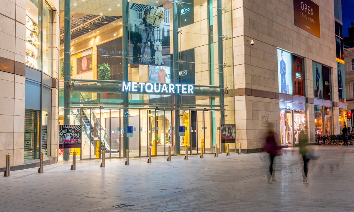
This included external, illuminated signs to the dual entrances, one within a conservation area, and a full signage family, which included five totems, sub directories and directional pictograms. Two materials were used Corian and shot-blasted stainless steel, which included fine details to reflect Metquarter’s history and respectful to the environment.
The external signage consisted of two sets of opal acrylic internally LED illuminated built up rimless letters mounted on to a rail behind to support each letter, with a minimal impact on the visual appearance, but also to be sympathetic to the Victorian architecture.
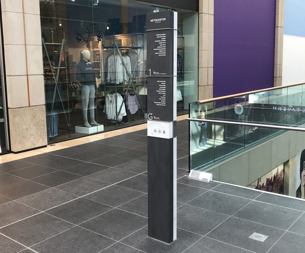
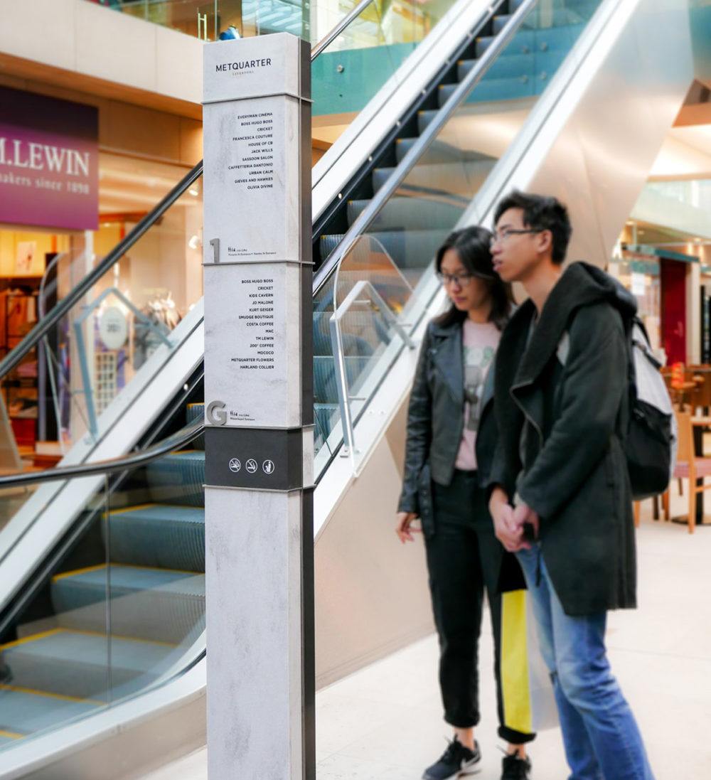
The internal 2.1m wayfinding totems comprised of two types of Corian to create the contrasting colours, representing the modern and historic sides of the building. 316 grade stainless steel frame and floor level numbers were included within the totems, alongside vinyl text of tenants within the shopping centre.
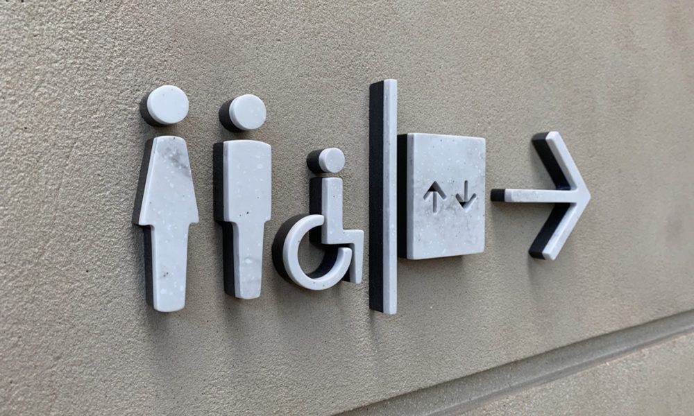
The two material theme ran across the rest of the internal signage, such as in the sub directories, using the same stainless steel and vinyl combination as the totems. The other internal element was wayfinding pictograms, which also used the two contrasting materials. However on this occasion they were layered to create added depth to the element while still having the same motif as the other components in the signage family.

